Anstoss: one app for the whole club.
Amateur football clubs run on a pile of tools that were never built for them: WhatsApp for chat, Doodle for RSVPs, a PDF for the lineup, a spreadsheet for the table. Anstoss replaces all of it with one white-label app in the club's own colours. An independent side project I designed end to end, from the research through the role-based IA to the interface, then took to functional Android and iOS builds with AI-assisted tooling.
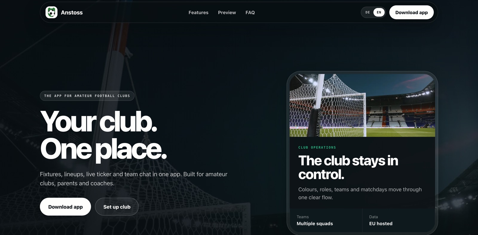
The product site and marketing site, at anstoss.io.
Research and current-state analysis
Anstoss started as my own Sunday-morning admin. I help run an amateur side, so I had the problem before I had the brief. To turn it into one I did three things: mapped every tool a club touches across a single match week, ran informal interviews with coaches and club admins at other clubs, and read the support threads where volunteers ask each other how to keep a squad organised. Three patterns came back every time.
The coach is also the admin
One volunteer owns comms, attendance, lineup, and the kit. Any tool that adds work, however small, gets dropped by the next fixture.
Information is scattered and stale
The lineup lives in a screenshot, RSVPs in a poll, the table in a browser tab. Nothing is a source of truth, so the same questions get re-asked in the group every week.
Club identity influenced adoption
People show up for the crest, not the software. Any club tool that looks generic, or like someone else's brand, never feels like theirs.
What the app had to be before anything was drawn
The bet behind the design: a club will replace ten tools with one, but only if the one feels like the club rather than like software. Working alone, nothing external constrained scope, so I set explicit criteria a feature had to meet before it earned a screen. Every feature that tempted its way in had to answer these six questions first, and most did not.
Volunteer coaches, players, and parents at amateur and youth clubs.
One white-label app for chat, fixtures, lineups, RSVP, and the table.
The current ten-tool stack is fragile, generic, and re-built every season.
Across a match week: midweek planning through Sunday kickoff.
On phones, often pitch-side with one hand and bad signal.
Role-based views, a multi-team data model, and an overlay for one-tap actions.
One app, four very different jobs
Role was the hardest constraint. A coach, a player, a parent and a club admin open the same app and need almost opposite things. I designed around role-based views so each person sees only what is theirs, with a separate, safer space for parents of under-age players.
Coach
Builds the lineup, sets the schedule, posts announcements, runs match day from one screen.
Player
Sees fixtures, RSVPs in one tap, reads the team chat, votes for man of the match.
Parent
A dedicated channel, kept separate from the player group, for under-age teams and logistics.
Club admin
Manages multiple teams, roles, and membership across the whole club from one account.
From empty club to first whistle
Everything depends on the first ten minutes. If a coach cannot stand up a club and get players in before they lose patience, nothing else matters. I designed setup to lean on what a club already has: phone numbers. A coach creates the club, invites by number, and players are auto-matched into the right team.
Underneath, I structured the product around clubs from the start, not single teams: multiple teams per club, role-based access, a parent channel, and membership dues that track manual payments or a provider. It is the kind of decision that is invisible when it works and impossible to retrofit when it does not.
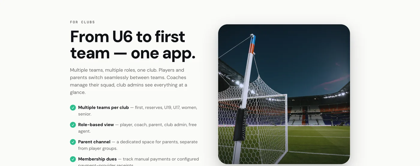
Club identity influenced adoption
Belonging was the strongest signal in the research, so the headline decision was white-label by default: club colours, crest, and kit, with no generic blue and no Anstoss branding on top of someone else's identity. The in-app surfaces, match day and team chat, are designed to feel like the club's own product, down to translating messages so a mixed-language squad can still read the group.
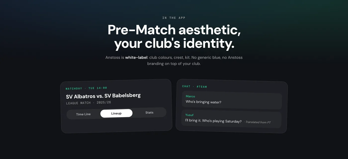
Match day and team chat, rendered in each club's own colours.
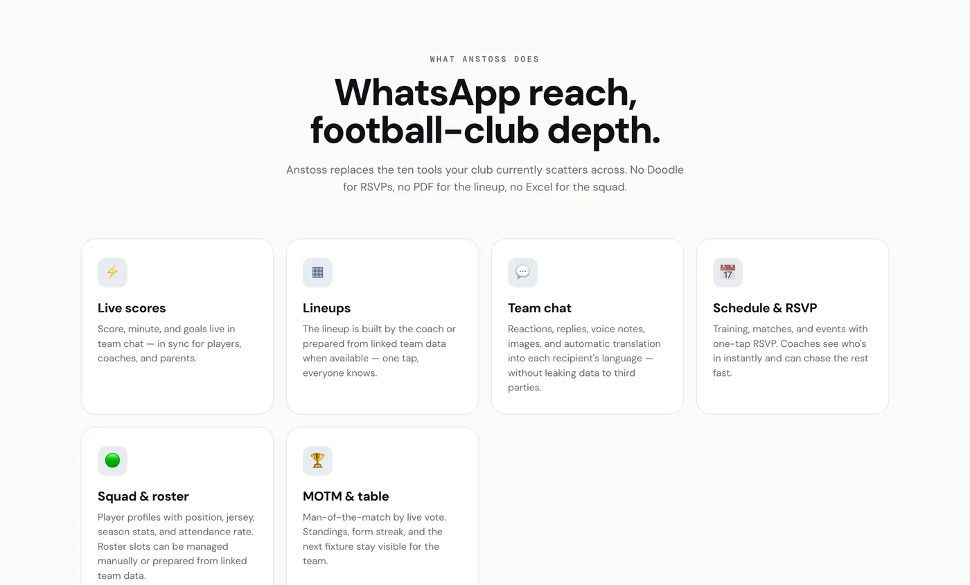
The second decision was to keep the feature set narrow, live scores, lineups, team chat, schedule and RSVP, squad and roster, and man-of-the-match, because every extra feature is one more thing a volunteer has to ignore. That list is what the current build does, not what it might do later.
Three things I refused, and what each cost
The hard part was refusing features, with nobody else to argue the case. Three decisions shaped the design more than any screen did.
No generic theme, ever
White-label per club was the whole bet, so I would not ship a default blue skin to make onboarding faster. The cost: every club starts from a blank crest, and there is no single screenshot of "Anstoss" to market. I would now ship a strong default identity a club edits down, rather than one it builds up from nothing.
Narrow beats complete
Live scores, lineups, chat, schedule and RSVP, squad, man-of-the-match. Nothing else passed the gate. The cost: Anstoss loses any feature-count comparison against a broader competitor, and I have had to say no to requests I agreed with.
Free for amateur clubs
The users are volunteers spending their own evenings. Charging them at launch would have killed the adoption the product needs to be worth anything. The cost: no revenue signal, so I have to read demand from usage and word of mouth instead of willingness to pay.
The test I have not run yet
The build is in real use but under-instrumented. What I want to watch is whether a club still runs match day in the app in week six. A club that comes back for a second month has replaced the ten-tool stack; one that does not has only tried it.
Deciding what the AI is allowed to do
Anstoss includes two AI features, both scoped by the same question: what happens when the model is wrong, and who deals with it? In a volunteer-run club that is always a person, so the AI is built to hand work back rather than take it over.
It suggests the lineup. It never picks it.
Squad insights surface as suggestions a coach accepts or ignores. A wrong suggestion costs a glance; a wrong automated team selection costs a coach their standing with parents on Sunday. That asymmetry, not model quality, is what set the scope.
Translation is an inclusion feature, not a demo
Squads are mixed-language, so chat translates in place and a parent who does not speak the squad's main language can still follow the group. It earned its place because it removes a reason someone drops out of the conversation, which is the thing the product exists to prevent.
What I turned down
The most impressive-sounding version, an AI that picks the eleven, is the one I chose not to pursue. It would demo well and be wrong in the exact moment it mattered.
From design to a functional product
I used AI-assisted tooling to turn my specifications and interface designs into functional Android and iOS builds. My responsibility stayed design: the workflows, reviewing what came back against the spec, testing behaviour, finding edge cases and iterating on usability. Functional testing exposed constraints that were not visible in a static prototype, and features that only worked in a mockup were cut before they reached a build.
The floating overlay
The signature feature surfaces key actions on top of other apps. Designing it meant living inside real Android constraints, overlay permissions, draw-over behaviour, and battery. It had to be useful in one tap and invisible the rest of the time.
AI that keeps the coach deciding
AI surfaces squad insights but never picks the lineup. I designed it as suggestions a coach accepts or ignores, so the bench decision stays with the person who has to answer for it on Sunday.
Shipping reality
Getting to the store meant app signing, deep-link verification, and a review queue, the unglamorous work that decides whether a design ever reaches a phone. AI-assisted tooling kept that loop short enough to learn from.
Tested against a real season
Reaching a functional build quickly meant I could put it into a real club's hands and watch. I ran Anstoss across a run of actual fixtures, tracking two things: where onboarding stalled, and whether the overlay helped or got in the way. That loop drove the changes that mattered.
Onboarding got shorter
The first coach I onboarded never finished the manual roster, he typed three names and switched back to WhatsApp. So invites moved to phone numbers and auto-matching, and the next setup ran without me in the room.
The overlay got quieter
Early versions surfaced too much. Watching it crowd the screen during an actual match pushed it down to the few actions a coach reaches for mid-game.
What I would change: per-club theming is the reason clubs adopt it, and it is also why there is no single screenshot of "Anstoss" to show and every club starts from a blank crest. If I ran it again I would design a stronger default identity that a club edits down, rather than one it has to build up from nothing.
Where the product stands
Anstoss is built for Android and iOS and submitted for store review. It is free for amateur clubs, with a white-label build per club, and the floating overlay and AI features work in the current builds. The intent was to replace the ten-tool stack with one app, and it proved out a way of working: research the problem, design the system, reach a functional build with AI-assisted tooling, and let real use reshape it.