Bitchain: a crypto wallet for everyday people
As cryptocurrency moves beyond speculation into daily payments, the next wave of users needs wallets that feel as simple as banking apps. Bitchain is a mobile crypto wallet designed for managing, sending, and tracking digital assets without the complexity of traditional exchanges.
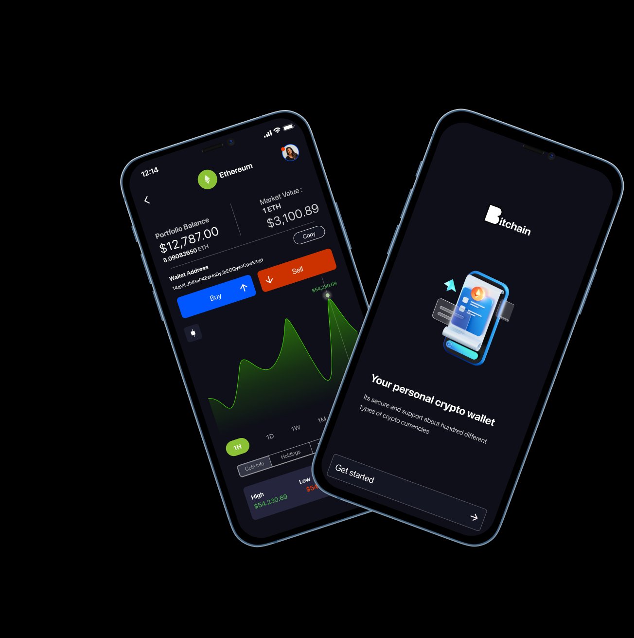
First-time users quit before the wallet is set up
Crypto-curious users aged 18-35 who hold or want to hold digital assets but find current wallets intimidating
A mobile wallet that makes crypto management feel as natural as checking a bank balance
As crypto adoption grows beyond early adopters into mainstream payments and savings
Mobile-first (iOS + Android), used on the go, at point of sale, and for peer-to-peer transfers
Most first-time crypto users abandon wallet setup before they finish it. Current tools assume blockchain literacy that mainstream users lack
Simplified onboarding, plain-language UI, real-time portfolio views, and transparent fee structures
Understanding crypto-curious users
I conducted 12 in-depth interviews with people who either hold crypto casually or are interested but intimidated. I also ran a competitive audit of Coinbase Wallet, MetaMask, Trust Wallet, and Phantom to identify UX gaps.
Interview findings
Users wanted three things: see total balance in their local currency, send crypto as easily as a bank transfer, and understand fees before confirming anything.
Competitive gaps
All competitors use blockchain jargon in their UI. None show fees upfront. Onboarding flows average 8+ steps. No competitor effectively explains what users are doing at each step.
Three user types, one wallet
Maria, 26
"I get paid in ETH sometimes but I have no idea what my actual balance is in euros."
- Goals
- See balance in fiat, send to clients, track income
- Frustrations
- Confusing interfaces, hidden fees, no expense categories
Daniel, 31
"I want to accept crypto payments but the wallet apps feel like they are made for developers."
- Goals
- Accept payments, convert to fiat, simple bookkeeping
- Frustrations
- Complex setup, jargon-heavy, no receipt features
Amina, 23
"My friends told me to buy Bitcoin but the apps scared me away."
- Goals
- Buy first crypto, understand what she owns, feel safe
- Frustrations
- Intimidating onboarding, fear of mistakes, no guidance
Download to first transaction in under 60 seconds
Dark, clean, confidence-building
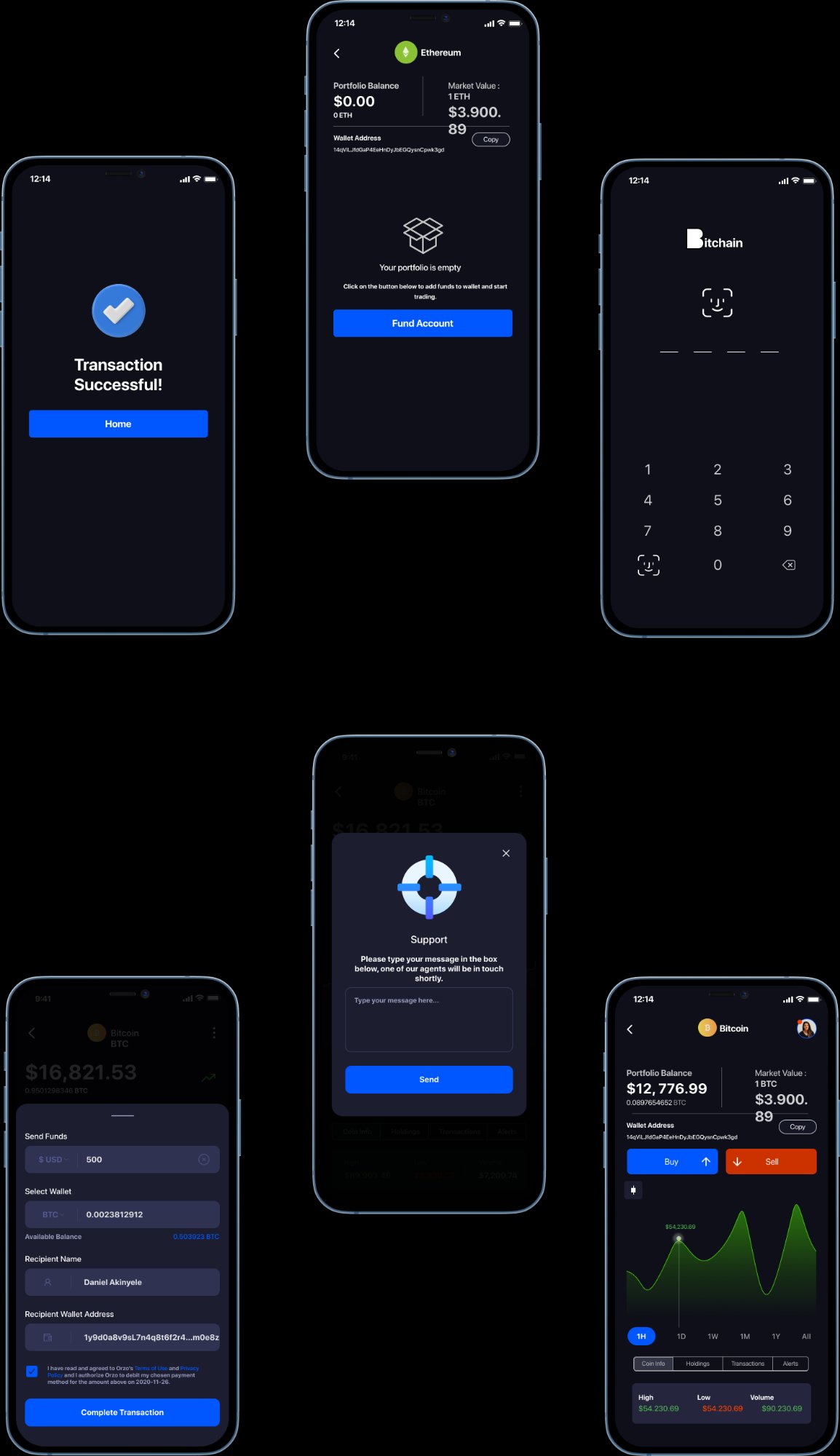
The dark theme signals premium and security. Every screen prioritizes the user's balance and recent activity. Blockchain jargon is replaced with plain language. Fees are shown upfront, never hidden.
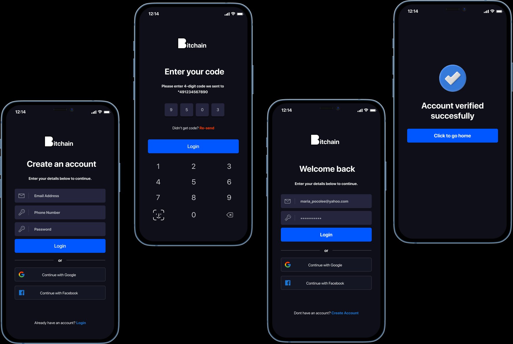
Onboarding carries one idea per screen, so first-time users are never asked to learn blockchain terms before they can act.
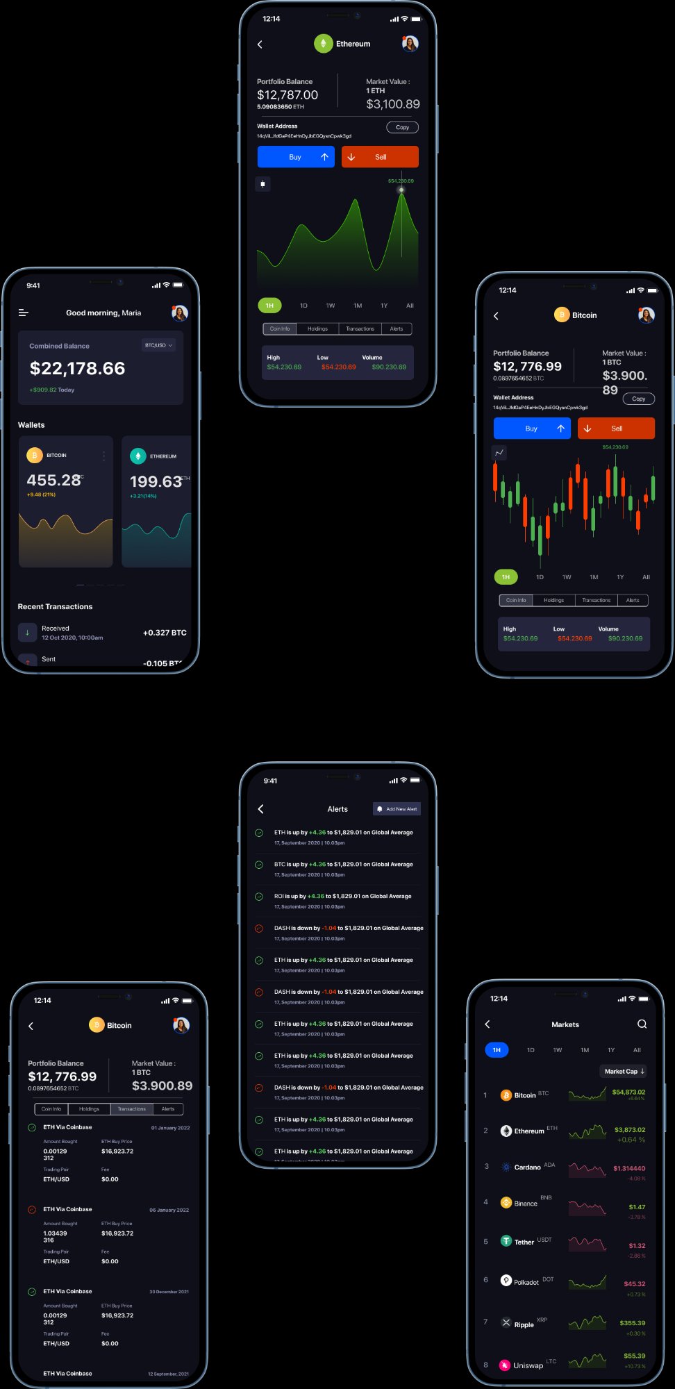
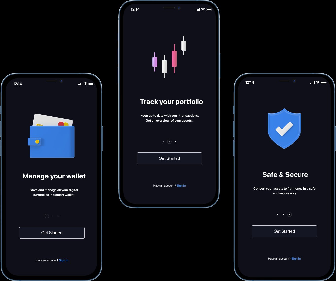
PIN and biometric auth make security feel routine; the coin detail leads with local-currency value, not token amounts, so balances read like a bank app.
Validated with 12 participants
Task completion
Key metrics
Dark theme increased trust perception
10/12 users said the dark interface felt "more secure" and "more professional" compared to light-themed competitors.
Send flow needed address validation
3 users entered invalid wallet addresses. Added real-time validation and a QR scanner as the primary input.
"Gas fees" confused everyone
Renamed to "Network fee" with a plain-language tooltip. Showed fee amount before confirming, not after.
Simplicity is the hardest crypto problem
"Send crypto" should feel exactly like "Send money." The design challenge is not hiding complexity but translating it into familiar patterns.
Trust is built in the first 30 seconds
The onboarding sequence does more for trust than any security badge. A clean, guided, no-surprises first experience tells users: this app respects your time and your money.