Simplifying climate target validation for global enterprises
I redesigned a 14-step compliance validation workflow into a 6-step guided flow, on an enterprise platform used by sustainability teams at thousands of companies. Sole designer on the flow, working across three product squads.
Work under NDA
Due to confidentiality, some interface details are simplified or omitted. I can discuss the process, decisions and collaboration model in more detail in an interview.
Context and business problem
Sustainability managers, analysts and regulatory leads at large enterprises use this platform to submit climate commitments. It treated a multi-session expert task as one rigid form: fourteen sequential steps, no progress saving, and requirements that only surfaced as errors. Most people gave up partway and rebuilt their progress in spreadsheets.
Two figures were already instrumented and nobody disputed them: a 67% abandon rate and a 4.5-hour median completion time. What was disputed was the fix. The redesign had stalled once already, because product, engineering and climate policy each held a different assumption about which of the fourteen steps the regulation actually required, and nobody could concede without proof.
So the first job was not to design anything. It was to find out which steps were legally required and which were habit.
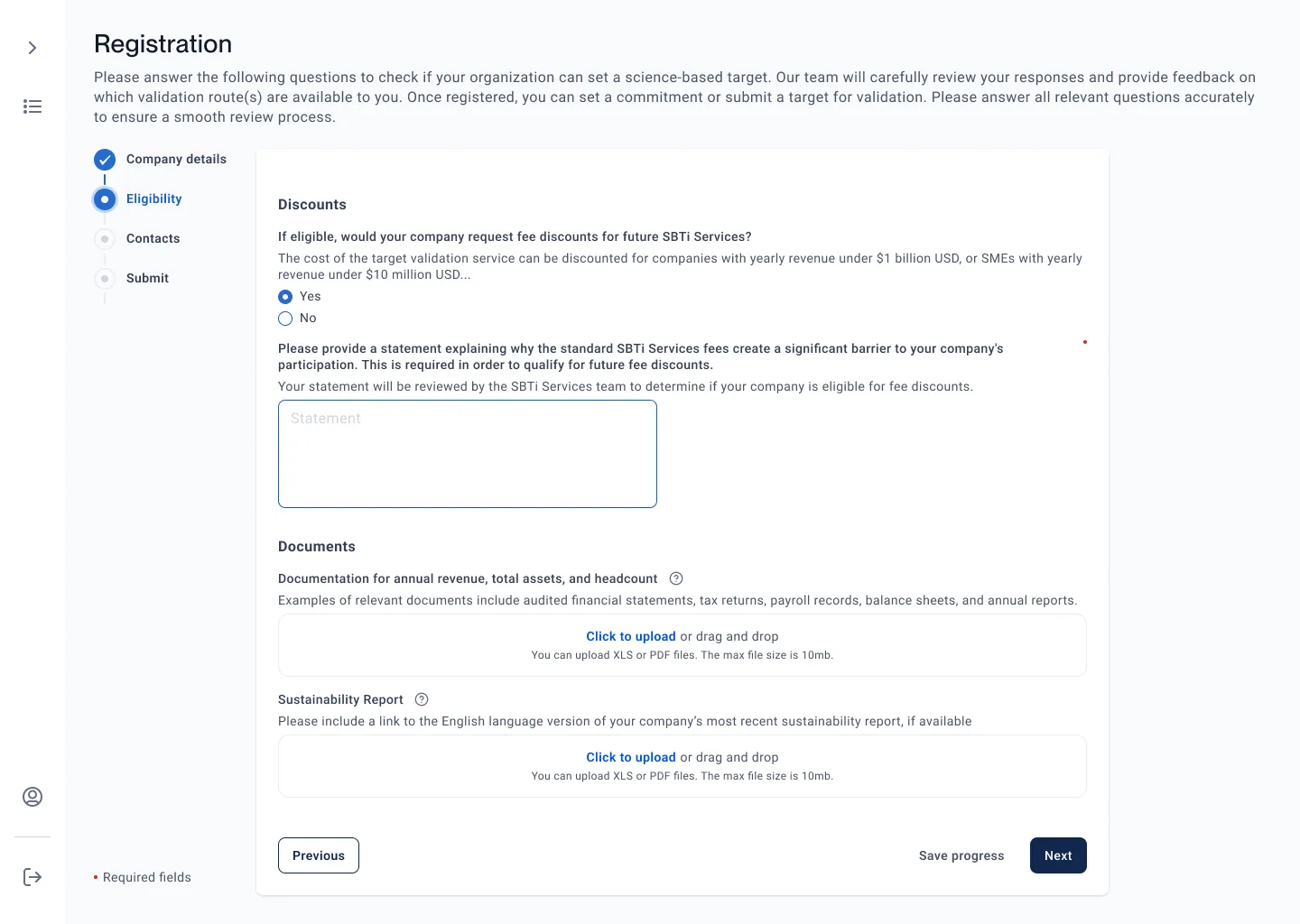
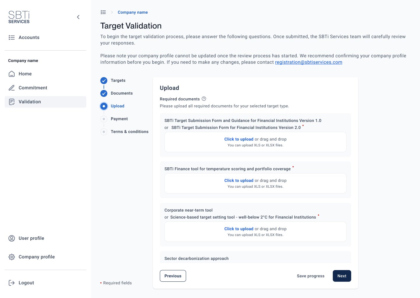
Actual product screens shown with permission. Full product under NDA.
30+ sessions with enterprise users
Moderated sessions with sustainability managers, analysts and regulatory leads across energy, finance, manufacturing and tech, run alongside an audit of the flow against the regulation itself. Each of the fourteen steps was put to the policy specialists as a claim to be checked, rather than as an opinion to be argued.
That settled it. 8 of the 14 steps were legacy artifacts, not legal requirements. The scope argument ended in one session and three squads committed to the same six-step target.
User interviews (n=16)
Users were not confused by the data itself, but by the system's inability to show where they were and what came next. Progress visibility was the #1 request.
Task analysis (n=8)
Observed real submissions. Most common workaround: spreadsheets maintained alongside the platform to track progress manually.
Stakeholder workshops
Facilitated assumption-testing workshops with product, engineering, and policy. The 30% engagement lift is a production analytics figure measured after launch, not an attribution to any single change.
Regulatory mapping
Worked with policy experts: 8 of 14 steps could be consolidated without compliance risk. Legal requirements vs. legacy artifacts.
The diagnosis I rejected
The obvious reading of a 67% abandon rate on a climate-data tool is that the data is too hard, and the fix is to ask for less. The research did not support it. People were not confused by the numbers they were asked for. They were confused about where they were in the process and whether their work still existed.
The spreadsheets kept alongside the platform were not a workaround for the data. They were a workaround for progress tracking, which the product did not have. That is a continuity problem, not a comprehension problem, and the outcome supported it: progress indication, auto-save and explicit confirmation moved completion more than any change to the fields.
Symptom
67% abandon rate, 4.5-hour median completion, recurring support complaints.
The tempting diagnosis
The data model is too complex for the people submitting it. Simplify what is asked.
What research showed
Comprehension was fine. Orientation was not. Progress visibility was the single most requested thing across 16 interviews.
The actual cause
A multi-session task modelled as a one-shot form: no persistence, no position, late validation.
Three roles, one workflow
The sessions clustered into three working roles, each with a different relationship to the submission. These are summaries built from the research, not individual participants. I designed for all three, which is the trade-off below.
The Submission Owner
Spends more time working around the tool than doing the analysis.
- Owns
- Getting the submission complete and on time
- Blocked by
- No progress saving, requirements that surface late
The Data Provider
Knows what data is required, but the system makes it hard to supply.
- Owns
- Document accuracy and scope coverage
- Blocked by
- Rigid input formats, no inline guidance
The Reviewer
Reviews dozens of submissions a quarter and needs status at a glance.
- Owns
- Batch review, audit trail, sign-off
- Blocked by
- No dashboard, manual status tracking
From 14 steps to 6
Step progress indicator
Persistent 6-step bar showing completion, current position, and estimated time. Users can jump between completed steps without losing data.
Auto-save + resume
Submissions auto-save every 30 seconds and resume exactly where the user left off. Eliminated the #1 complaint.
AI-powered scope analysis
Recommendation features surfacing guidance from unstructured documents. Users can trust, audit, and override AI outputs.
Inline validation
Replaced post-submission errors with inline guidance. Users see what is needed as they work, not after they submit.
Two directions I turned down
Rejected: design for one primary user
The 30 sessions clustered into three working roles with genuinely opposed needs. The submission owner wants to stop and resume, the analyst wants input guidance, the reviewer wants status at a glance. Optimising for the owner alone would have meant a cleaner flow and a faster build.
Why not: the reviewer is the reason a submission completes at all. Leaving them on manual status tracking would have moved the bottleneck, not removed it.
Rejected: let the AI decide
The scope analysis could have filled the step directly instead of recommending. That version demos better and saves more time.
Why not: reviewers would not accept a recommendation they could not audit, and trust scored 3.8 of 5, the lowest of the validated findings. This is a submission a company answers for publicly, so the AI recommends and the accountable person decides.
Both cost something. Three roles meant more screens and a longer build, and the most impressive version of the AI feature is the one that did not ship.
Staying with it through build
Build ran across three squads over five months, and I stayed on it. The recurring question was which part of the flow could ship next without leaving a submission half-migrated.
Specifications engineers could build from
Where a compliance checkpoint could not move, the spec said so on the screen it affected, rather than leaving engineering to find out in review.
AI search and recommendation
I designed the AI step over unstructured documents and specified how it had to behave: show its confidence, explain its source, and leave the decision with the reviewer. I worked with engineering through implementation and checked the built behaviour against the spec.
After launch
I redesigned the target dashboard, reading funnel behaviour and the support queue to decide what to change rather than working through what we had planned beforehand. Related support tickets fell by about 40% in the following quarter.
How the five months ran
Establish the problem in numbers
30+ moderated sessions, read against the instrumented abandon rate and completion time. Nothing was designed in this period.First, because the rebuild had already stalled once on opinion.
Settle the scope with policy in the room
Each step checked against the regulation with policy in the room. 8 of 14 were legacy artifacts, and three squads committed to the six-step target.Before a screen was drawn. Scope disputed mid-build is scope that creeps back.
Ship the flow in pieces that can stand alone
The ordering constraint was migration, not value. That ruled out sequencing by what was most visible.A regulated submission in an inconsistent state is a compliance incident, not a bug.
Rebuild the dashboard on what shipping revealed
Funnel behaviour and support signals decided what changed next. Related support tickets fell about 40% the following quarter.Everything planned before launch was planned for the fourteen-step flow, so most of it no longer applied.
From the lever to the outcome
Step count was the lever, not the outcome. It only mattered if it moved submission completion, because an incomplete submission is a company that has not filed its climate target. This is the chain I committed to before the rebuild, with what each link measured after it.
1. Remove the steps that are not legal requirements
Audited with policy against the regulation, not negotiated. 8 of 14 steps were legacy artifacts. Measured: 14 steps to 6.
2. Make a long task survivable
The task is multi-session and expert. Progress saving, progress indication and explicit confirmation let people stop and return instead of restarting. Measured: 4.5 hours to 1.2 hours median, production analytics.
3. Fewer, survivable steps means fewer people give up
The failure was abandonment partway, then rebuilding progress in spreadsheets. Measured: 67% to 18% abandon rate, production analytics, quarter before against quarter after.
4. Completion is the business outcome
More submissions completed is more targets validated, and the workload moves off the support queue and onto the platform. Measured: engagement up 30% and related support tickets down about 40% in the following quarter.
The counterfactual is not clean. A regulatory deadline falls in the same quarter as the launch, so some of the engagement lift belongs to it. Step count and completion time are attributable. Abandon rate and ticket volume are directional.
Measured two ways, not combined
Production analytics compares the quarter before launch with the quarter after. The usability round is eight enterprise users on the redesigned flow.
Production analytics, before and after
Moderated usability testing, n=8
What I learned about regulated workflows
Certainty mattered more than speed
These submissions carry regulatory and financial consequence, so users were unwilling to act without knowing where they were in the process and whether their work was saved. Progress indication, auto-save and explicit confirmations did more for completion than any change to the forms themselves.
Expert users rejected automated decisions
Testing showed reviewers would not accept a recommendation they could not audit. Trust scored 3.8 out of 5, the lowest of the validated findings. I designed the recommendation to show its source, explain its reasoning and offer an override, so the decision stayed with the person accountable for it.