Outbound: AI-powered travel planning
An AI travel planning app that generates personalized itineraries, manages bookings, and tracks trips with a passport stamp gamification system. From idea to detailed itinerary in seconds.
Visit the live site at tripoutbound.co ↗
Trip planning is fragmented, and most people quit it
Planning a trip means juggling a dozen browser tabs, a notes app, a spreadsheet, and three booking sites that do not talk to each other. The hardest moment is the blank page: deciding where to go and what a day should actually look like. Travelers stall there, save a few links, and never finish. The plan ends up half-built in screenshots and group chats, and the trip either gets booked last-minute or not at all.
Outbound starts from a different premise. AI can remove the blank page by drafting a full, day-by-day itinerary in seconds, so the user edits and reacts instead of building from zero. The design problem was not "add AI" but deciding where the AI leads and where the person stays in control, then keeping a live product simple enough that planning, booking, and the trip itself live in one place.
Travelers aged 22-38 who plan on their phone and want a trip shaped around their taste, not a generic list
An AI app that drafts a full itinerary from one prompt, then manages bookings and tracks trips you have taken
Across the whole arc: inspiration, planning, booking, and the trip itself, mostly in short on-the-go sessions
Mobile-first, live on iOS and the web, designed for thumb reach and one-handed use
Planning is where most trips stall. Killing the blank page is the highest-leverage thing a travel app can do
Fast AI draft you can edit and lock, unified booking management, and a passport that rewards finishing trips
Where planning breaks down
I ran nine interviews with people who had planned a trip in the last three months, walked the planning-to-booking path on the four tools they reached for most, and mapped where intent leaked out of the funnel. Three patterns held across almost everyone.
The blank page is the real blocker
Interviewees did not struggle to book once they knew the plan. They struggled to commit to a shape for the trip. Seven of nine had a half-finished plan sitting in notes or saved links they never returned to.
Planning lives in scattered tools
A typical trip touched five to nine surfaces: search, maps, a notes app, a spreadsheet, and separate booking sites. Nothing held the whole picture, so the plan existed only in someone's head.
Existing tools ask before they give
The competitive look showed planners that gate value behind sign-up and long preference quizzes. People wanted to see a credible plan first and judge whether the tool understood them before investing anything.
Finishing a trip has no payoff
Once a trip ended it vanished. Nobody had a place that remembered where they had been, which removed any reason to come back between trips and any sense of momentum.
The job is to remove the first decision, not add features
If the app produces a credible plan the user can react to within the first session, everything downstream gets easier. That reframed the brief from a planning toolbox to a fast draft you stay in control of.
Designing for different traveler types
Yuki, 26
"I plan trips on the fly. I do not want to spend 20 minutes setting up an app."
- Context
- Books long weekends on short notice, often deciding the destination days before flying. Plans entirely on her phone, usually in transit.
- Goals
- See a credible plan in the first minute and judge whether the app gets her taste before committing anything.
- Frustrations
- Sign-up walls and preference quizzes that demand effort before showing a single result.
Daniel & Priya, 31
"One of us starts a plan, the other never sees it, and we end up booking twice."
- Context
- Plan two or three bigger trips a year together but rarely at the same time or device. The plan lives in scattered screenshots and a half-dead group chat.
- Goals
- One shared itinerary both can edit, with bookings attached so nothing gets double-booked or lost.
- Frustrations
- Tools built for one account, where collaborating means forwarding links and re-explaining decisions.
Marco, 24
"Once a trip is over it just disappears. There is nothing to show for it."
- Context
- Travels often and cheaply across many countries, optimizing hard on cost. Treats the trips themselves as a collection worth tracking.
- Goals
- A record of where he has been that builds over time and gives him a reason to come back between trips.
- Frustrations
- Planners that forget him the moment a trip ends, with no memory and no sense of momentum.
The planning flow
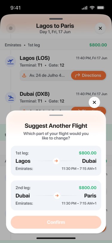
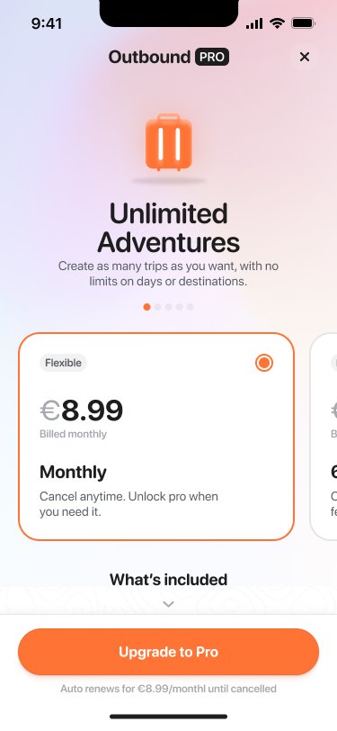
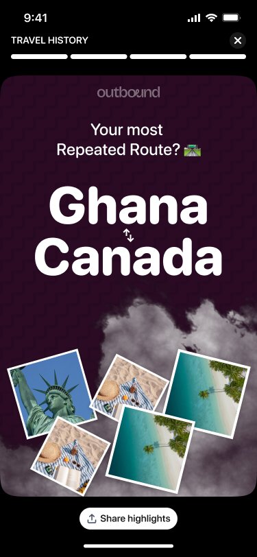
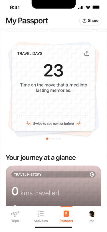
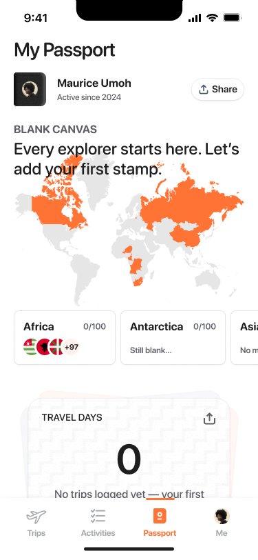
The orange-and-white palette evokes warmth and adventure. AI generates complete itineraries from natural language prompts. The passport feature tracks trips and collects continent stamps, creating engagement beyond trip planning.
Three decisions, and what each one cost
Every decision below traded something away. I tried to be explicit about the tradeoff rather than pretend the easy path was free.
AI drafts fast, the user stays in control
The app generates a full day-by-day itinerary in one pass so the first thing you see is a real plan, not an empty form. But a draft you cannot change is worse than no draft, so every block is editable and lockable: lock the parts you like, regenerate the rest. Tradeoff: a slower, more deliberate first screen than a pure one-tap magic moment, in exchange for trust and a sense of authorship.
Show value before asking for sign-up
Research showed people quit when a tool asks before it gives, so the first itinerary generates without an account. Tradeoff: I lose early account capture and some analytics on those sessions, but a person who has seen a plan they like has a real reason to sign up, instead of a blind wall.
Unified booking, not another tab
Bookings attach to the itinerary they belong to, so the plan and the reservations stay in one place instead of scattering across email and apps. Tradeoff: deeper integration work and more states to design, but it is the only way the app holds the whole trip rather than being one more silo.
Gamification that rewards, never nags
The passport stamps a continent when a trip is done, turning finished trips into a collection worth coming back to. I deliberately kept it pull, not push: no streaks, no guilt notifications, no daily login bait. Tradeoff: weaker short-term engagement hooks, but the reward stays tied to real travel instead of manufacturing fake urgency.
Validated with 8 travelers
Task completion
Key metrics
The passport screen was the emotional peak
Finding: nearly every tester reacted out loud at the Passport screen, the only point in the flow where that happened. Decision: I treated it as the app's signature moment rather than a side feature, pulling the continent stamp into onboarding so people meet it before they have even taken a trip. Result: the moment now anchors the product's identity, and "Passport Approved" was the detail testers brought up most.
Auth errors lost people at the worst moment
Finding: a generic "Invalid code" on the OTP step left testers stuck and unsure whether to wait, retry, or restart. Decision: I rewrote the copy to say what to do next, "Code does not match, check your email," and added a visible resend timer so the path forward was never ambiguous. Result: testers in the follow-up round recovered from a bad code without dropping out, turning a dead end into a self-service fix.
Where it landed
Outbound is live and early. These are design and testing outcomes, not adoption claims: the product is still small and the numbers below come from the moderated sessions and the first weeks of real use, so I am reporting them as directional, not proven at scale.
From prompt to a usable first itinerary
The AI draft collapsed what used to be hours of cross-tab research into one screen people could react to in under a minute.
Usability rating across 8 testers
One full point below ceiling, with the friction concentrated in sharing and auth rather than the core planning flow.
Task completion in testing
Core tasks completed cleanly; the lower scores on share and passport-discovery drove the next round of fixes.
Shipped and in front of real travelers
The design shipped as a working product at tripoutbound.co, where iteration now happens against actual usage instead of prototypes.
Where AI helped, and where it did not
The strongest version of the product was not the most automated one. People trusted the AI more when they could overrule it. The control I gave back through editable, lockable blocks was what made the speed feel safe instead of pushy.
Emotional milestones in onboarding
The "Passport Approved" moment was the one testers named unprompted. Onboarding should not just be functional. It should make users feel something.
Error states are conversations
"Oops!" is not helpful. "The code does not match, we just sent a new one" is. Every error state is a conversation with an anxious user.
Shipping changes the questions
Testing told me what confused people; living traffic tells me what they ignore. The next round is less about polish and more about earning the second session.