Pay4Me: international student payments, simplified
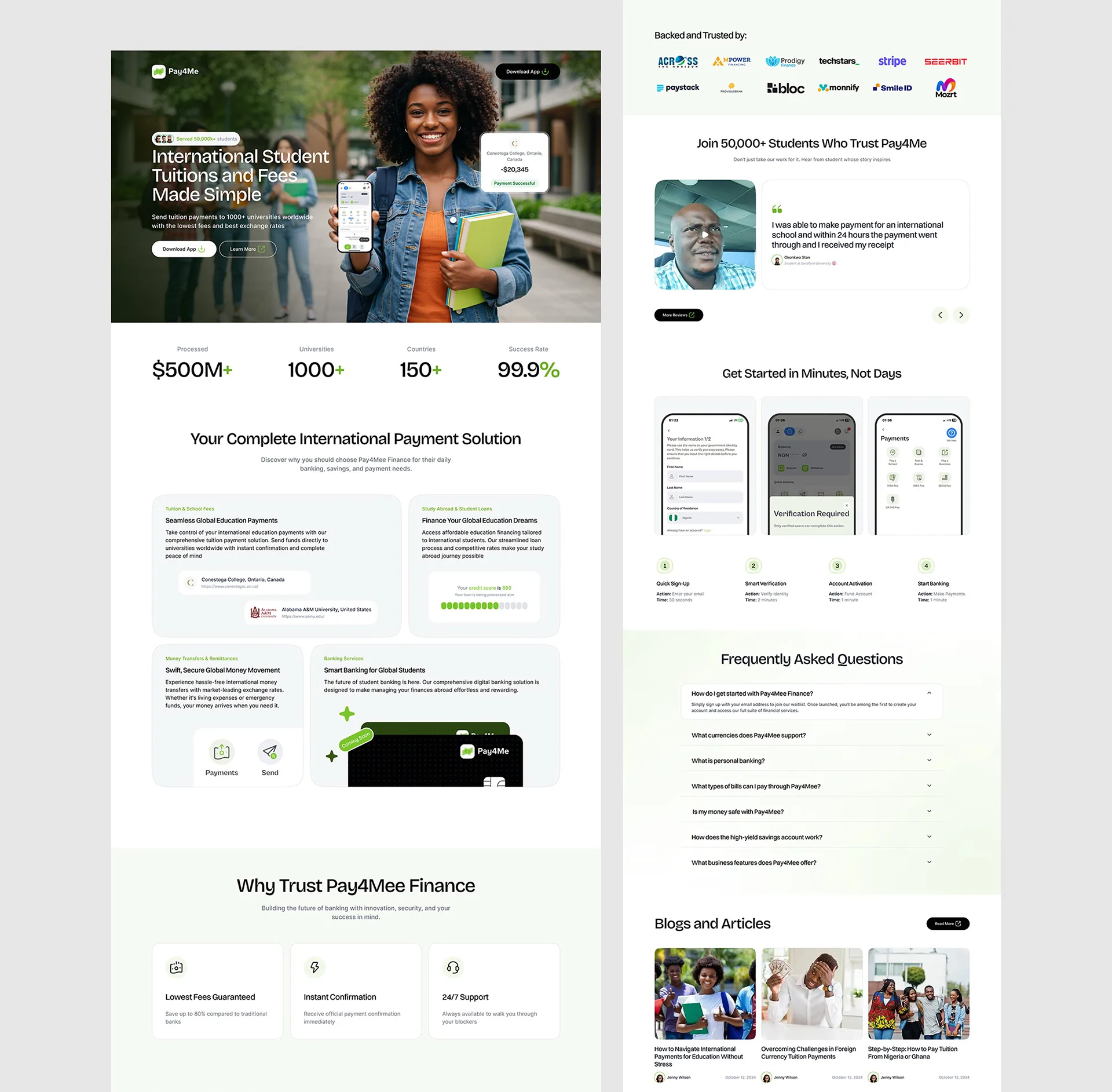
Redesigning the marketing site and onboarding for a platform processing international student tuition payments across 150+ countries.
Platform scale figures reported by Pay4Me. The +31% and -27% later in this case study are outcomes I measured during design-stage testing, not the same platform numbers.
Senders had never done this before, and the funnel leaked
Paying foreign tuition is a high-stakes, cross-border, trust-sensitive moment. For most families it is the largest single transfer they have ever made, often the first time they have moved money across borders at all. The existing marketing site asked people to start that transfer before it had earned their confidence, and the onboarding form treated identity verification as paperwork rather than reassurance.
International students sending tuition and the parents who sponsor them, mostly first-time cross-border senders.
A trust-first marketing site and onboarding flow for high-value education transfers.
During admission and enrollment windows, under hard university payment deadlines.
Web. People research on mobile, then complete the payment on desktop alongside their bank.
Most senders had never paid tuition abroad before. The old site led with product features, not proof, and the funnel leaked hardest at sign-up and verification.
Lead with trust signals and named outcomes, then make fees, FX, and live payment status visible at every step.
Where confidence broke down
I ran interviews with international students and sponsoring parents, then walked the existing funnel analytics step by step to see where intent turned into abandonment. The pattern was consistent: people did not drop out because the product was hard to use. They dropped out because at each step they were asked to trust the platform with more, and the interface gave them less to trust.
The break was at sign-up and KYC, not pricing
Most abandonment clustered at account creation and identity verification, not at the fee disclosure. People reached the verification step willing to pay, then stalled when asked to upload documents with no explanation of why or what happened next.
"How do I know this is not a scam?"
First-time senders looked for the same reassurance signals their bank gives them: a real company, named universities, and confirmation that the money actually landed. The old site led with marketing copy instead, which read as a warning rather than a welcome.
Verification felt like an interrogation
The onboarding asked for documents up front with no framing. Parents in particular wanted to know which document, why it was needed, and that their data was handled responsibly before they would proceed.
Research on mobile, pay on desktop
People compared options on their phone, then switched to a laptop to complete the transfer next to their online banking. A flow that only felt finished on one device lost the people who moved between them.
The student sends it. The parent needs to watch it.
Chioma Okafor, 22
"This is most of my family's savings. I need to know it actually arrived, not just that I clicked pay."
- Goals
- Send tuition before the deadline, see clear total cost, get proof of payment.
- Frustrations
- Fear of losing the money, hidden FX margins, no confirmation the university received it.
Rajesh Menon, 49
"I am paying from here for my daughter studying there. I want to follow the payment from start to finish."
- Goals
- Track status end to end, keep receipts, reach a human if something stalls.
- Frustrations
- No visibility once money leaves the bank, timezone gaps with support, unclear who has the funds.
Mei Chen, 54
"I reconcile hundreds of payments an intake. A clean reference matters more than anything fancy."
- Goals
- Accurate student references, predictable arrival, clean reconciliation data.
- Frustrations
- Manual matching, missing student IDs, payments that arrive without context.
Key decisions, and the tradeoffs behind them
Trust before product
The site now opens with concrete proof: named universities supported, country coverage, and real sender outcomes, before any feature copy. Tradeoff: the hero is slower to get to the call to action, but for a first-time high-stakes transfer, earning belief outranks shaving a scroll.
Transparent FX and fees up front
The full cost, including the exchange rate and any fee, is shown before sign-up rather than at the end. Tradeoff: it exposes the margin earlier and can look less competitive at a glance, but hidden costs were the single fastest way to lose a sender's trust, so honesty was the safer bet.
Live payment status tracking
Every transfer shows where the money is, from initiated to received by the university, with timestamps. Tradeoff: it commits the business to surfacing delays it would rather not advertise, but visibility was exactly what parents asked for and what cut support load.
Simplified, explained KYC
Verification is broken into short steps, each one stating which document is needed, why, and how the data is handled. Tradeoff: a few extra screens instead of one dense form, but the framing turned the most abandoned step into one people were willing to finish.
Cost first, verification second
What testing told us to change
I tested the redesigned flow with students and sponsoring parents, running the original and new onboarding side by side and measuring where people stalled, hesitated, or asked for help.
Reached payment without help
Trusted the platform with their money
Verification moved out of the way of the quote
In early tests several people backed out when KYC appeared before they had seen their final cost. We reordered the flow so people see the full transparent quote first, then verify, and added a one-line reason to each document request. Completion through the verification step rose noticeably in the next round.
What shipped, and what moved
Onboarding completion
More people who started the new sign-up and verification flow finished it, with the largest gain at the KYC step that had leaked the hardest.
Payment status support tickets
Live tracking answered the "where is my money" question before people had to ask, which took a steady share of inbound support off the team.
Countries covered at launch
The redesigned site and onboarding shipped across the full footprint of 150 plus countries and over 1,000 supported universities.
First-attempt payment success
A platform-reported figure, not one I measured. Clearer status and reordered verification were aimed at the same goal: more transfers completing on the first try, with fewer stuck or repeated attempts.
Sequencing the trust signals
You cannot claim trustworthiness in a headline. People grant it step by step, so each screen has to give a reason to take the next one. Reordering when we asked for verification mattered more than how the form itself looked.
Transparency is cheaper than support
Showing fees, FX, and live status up front felt risky to the business, but it removed the questions that drove the most anxiety and the most support tickets. Honesty earlier paid for itself later.
What I would do differently
I tested with 8 to 12 people, enough to find the big trust breaks but too few to trust the percentages. I also leaned on the platform's own scale numbers in the hero before separating them from my measured results, which blurs what the redesign actually moved. Next time I would size the sample for the claims I want to make and label borrowed metrics from the first draft.