Sportipb: redesigning a sports community platform
Full landing page redesign for a sports community platform connecting fans, players, and coaches. From fragmented fan experiences to a unified, conversion-optimized experience that lifted sign-ups by 42% over the prior page across the first eight weeks after launch.
Nobody understood the value in the first five seconds
Sports fans, amateur players, and coaches looking for a community beyond just scores
A landing page that communicates Sportipb's unique value and converts visitors to members
After competitor analysis showed no platform combining community features with live data
Web, responsive across desktop, tablet, and mobile (73% mobile traffic)
68% bounce rate and 2.1% conversion. Users could not understand the value prop in under 5 seconds
Research-driven redesign with A/B tested CTAs, trust signals, and progressive disclosure
Quantitative + qualitative discovery
I audited 6 months of analytics data, conducted 8 user interviews, benchmarked 6 competitors, and facilitated a stakeholder alignment workshop.
Bounce rate on existing page
Users leaving within 8 seconds on average. No clear value proposition in the hero section.
Could not explain what Sportipb does
Interview participants failed to identify the value proposition from the hero section alone.
Wanted trust signals
Testimonials, user counts, and partner logos were cited as sign-up motivators by nearly all participants.
Mobile traffic
Yet mobile conversion was 0.8% vs 3.4% desktop. The mobile experience was an afterthought.
Three user types with different entry points
Marcus, 24
"I follow 3 leagues across 2 time zones. I need everything in one place."
- Goals
- Live scores, tactical analysis, match-day community
- Frustrations
- Fragmented across 4+ apps, surface-level discussions
Aisha, 31
"I play Sunday league and coach U-12s. I want to connect with local players."
- Goals
- Game tracking, local community, coaching resources
- Frustrations
- Platforms cater only to elite sports
David, 45
"I need one platform for team management, not three separate apps."
- Goals
- Team management, parent communication, training content
- Frustrations
- Tools too expensive or too complex for his level
The solution, delivered
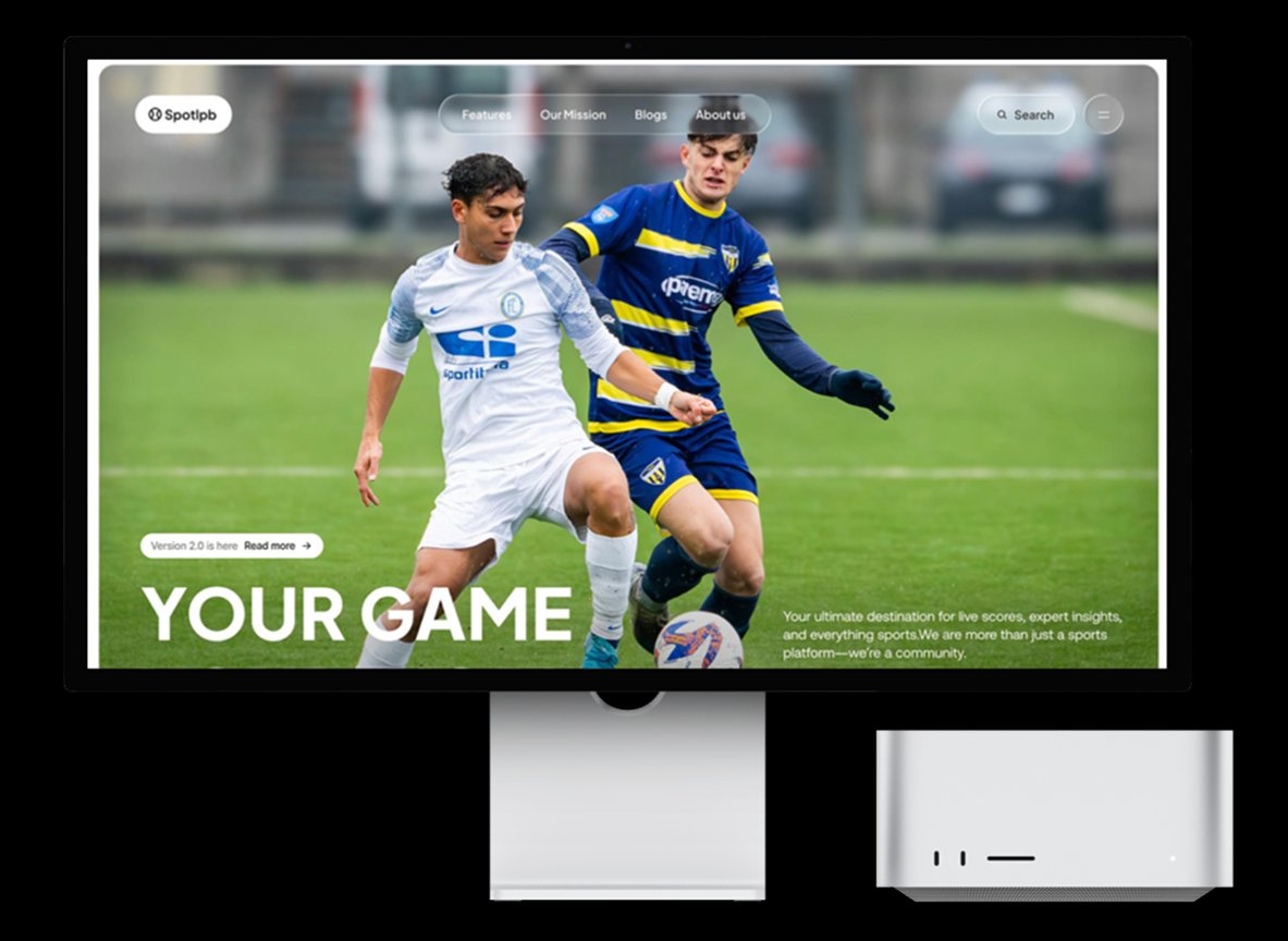
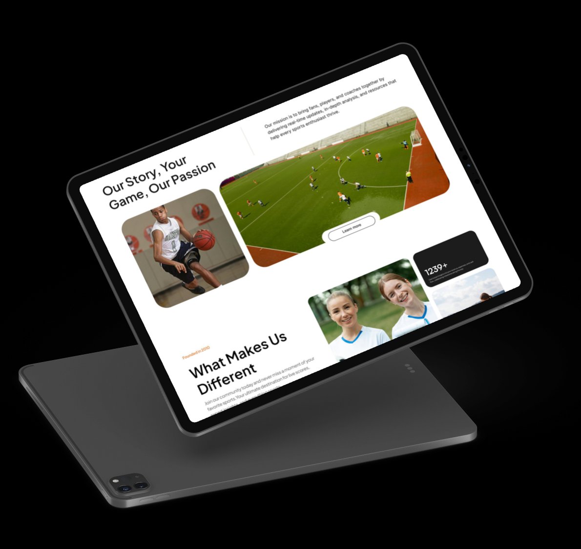
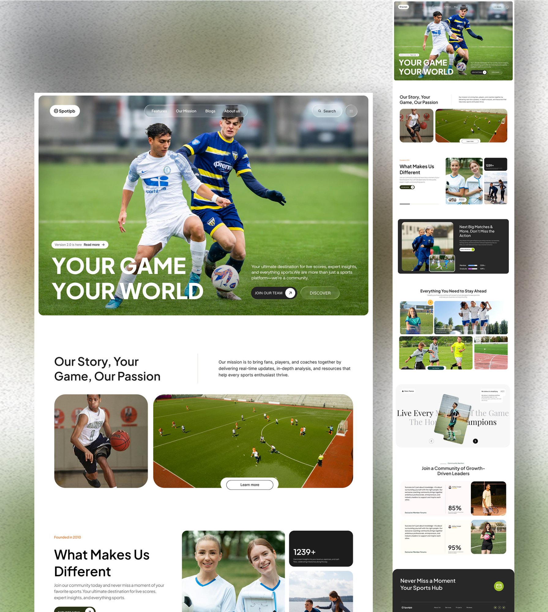
The redesigned landing page leads with an action-oriented hero, builds trust through community stats and social proof, and converts through community-framed CTAs. "Join Our Team" outperformed "Sign Up Free" by 59% in A/B testing.
Validated with 12 users across 2 rounds
Task completion
Key metrics
Community language outperformed transactional framing
"Join Our Team" beat "Sign Up Free" by 59% in A/B testing. Users are motivated by belonging, not features.
Mobile CTA was below the fold
On devices under 375px, the primary CTA was hidden. Fixed with a persistent sticky CTA bar on mobile.
Test before you polish
Guerrilla wireframe tests cost nothing but saved weeks. Validating the hero layout before any high-fidelity work was the single biggest time-saver.
Mobile-first is not a suggestion
With 73% mobile traffic, I should have started wireframes on mobile. Adapting desktop layouts down always creates compromise. Start small, scale up.